
Photos for print ads

originally the plan was to have a shredder that's see-through, since I believe it would convey the message much more effectively and prevent misinterpretations of the ad. however, I didn't have access to one/the money to buy one so we had to make do with an opaque shredder.
I was also originally planning to focus my vertical advert of a printer, but without
any idea of what to print I decided to just photograph Carole since she is the subject of my video and it ties everything in nicely. the images displayed above are the photos I think have the most potential.
I decided to shred the troll face image because it will be recognised by a large portion of my target audience (gen z). it appeared online not long before the 2010s and is still used today, meaning a huge portion of people will be able to pick up on what it is.
Editing print ads
I'm editing my images on Photoshop. Although I said I would stick with a grey black and blue colour scheme, I don't think it would work with the pictures I've ended up with. I'm leaning more towards white and red since they pop way more.


As you can see the text being black makes it significantly harder to read and its much less eye catching.

This is the first real draft with images I've taken. I had to change the colours as I previously explained, though I kept the text the same. in order to make the text a little easier to read against the background, I put a white vector beneath and lowered the opacity.
i did still create a version with the colours i was planning on using, swapping the red out for a blue.
I asked people for feedback and whether they preferred the red or blue. unsurprisingly, it was an easy win for the red text, everyone prefers it to the blue.


For the portrait advert I decided to fade the background out a little (70% opacity). Carole is still full opacity making her stand out against the background more. I achieved this effect by separating Carole from the background and creating a layer via copy.
The only thing missing from my print ads is some kind of logo to indicate to the reader what organisation they're actually looking at an advertisement for. I did do some rough drafts of logos and decided I wanted it to be simple and made up of a circle and arrow, since arrows pointing up are often used as a signifier for "uploads".

I used adobe illustrator for the logo design.


I made some colour variations of the logo so I can find out which one people think works best via feedback. I don't think the red is very good, through the white and green look a lot better than I expected them to on the ads.
Feedback:


From this feedback I've gathered that the landscape advert is much more effective than the portrait one, due to the figures and the content of the main image. I was worried the message wasn't clear enough, and while I think its pretty clear, obviously some people are finding the call to action a little hard to read - the part that mentions the goal being donations.


based on this feedback I think ill end up using the white logo, since I agree that it looks the most natural. the green also looks nice but I don't think it fits the colour scheme that well.


these are my final drafts of the print ads. I think the grey logo works the best although unfortunately its a little hard to see on the portrait ad since the background is essentially the same colour as the arrow.
Another issue I have is that the website link in red on the landscape ad is slightly hard to read, but I think its the best I could've done with that colour. I tried other colours but none looked as good as the red. I also put a low opacity box underneath all the text in order to help it stick out from the background.
Footage for Video


I filmed the footage of Carole and the clips of the computer screen separately as she wasn't available to re-shoot those parts. This means the screen is going to look a little different/darker in those clips compare to the ones featuring Carole.
In order to create the effect that what she's searching is no longer available, i had to create some custom google pages. I achieved this by googling something that returned no results, removing the search and replacing it with what Carole searches in the footage (in the same font of course).


I also made a fake pop up ad that would take her to the web preservation society's website after failing to find the content she's searching for.

Editing Video ad
I used this song from YouTube since it sounded pretty accurate to the kind of music they often play in these kinds of adverts, very slow, thought provoking and melancholic. its fitting that its called childhood as well since that's what the advert is focusing on - revisiting childhood memories in the future.

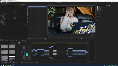


This is the first draft of my video advert. The clips of the computer screen were a little difficult to colour correct since they had these weird lines on the screen:

I did try increasing the exposure, whites and blacks as well as accentuating the highlights to get rid of these lines and brighten the screen, but I think it looks a little low quality and blown out for my liking. it definitely doesn't look as professional as I was hoping for but that's to be expected with no budget and a one man team.
Feedback:
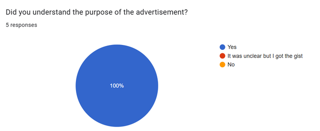


When receiving feedback i made sure to ask primarily people in my target audience. as expected, most of them understood at least one reference and found it funny which was my aim. I think it acts more like a parody of non profit advertisements, since it definitely doesn't take itself as seriously. the main thing is that nobody was confused by what it was trying to say and everyone was entertained somewhat, which I would consider a success!