
planning

Since I'm working on my own for this part of the project, I've decided to do 2 print adverts since I'm much better at graphics than filming.
I'm going to achieve this by looking into other cereal adverts that target a similar audience, creating mock ups, then reining them. once I have finalised designs, I'll collect data on whether others think the adverts are successful/appealing. If any improvements are given I'll consider them and make adjustments if necessary.

This poster's main image is of the box and an example of how you might enhance the cereal (fruit). The life's better shredded, the Change4life logo and the nutritional info at the bottom target this ad at a health conscious audience.

Primarily sticks to 2 vibrant colours, main text is in all caps - like they're yelling the announcement at you. also shows the box design so that in case you forget the name, you can recognise the cereal in stores.
Also has small text at the bottom disclosing nutritional info.


has a bowl of cereal somewhat in motion, makes it feel more exciting.
Mascot one of the largest things in the design
using made up words like monsterfied to embrace a silly nature and appeal more to children. I'm not a huge fan of the way the text is placed on this poster, it feels too random and uneven. the font is all caps and it has an outline. they also have statisti8cs like 20% more honey.
mainly 2 colours, features a bowl of cereal and two box designs. the letters in the text are misaligned and slightly janky, appeals to children more and adds a bit of movement to the ad. The O in oats is a piece of cereal - popular choice for these products
small nutritional text

Again, mascot one of the largest things in the design. improved recipe makes you want to pick it up and see how its changed. loved by kids, approved by parents, sways parents into getting it for their kids.
Huge logo tbh, rounded font, lowercase, geared for kids. in a milky splash - motion, excitement.
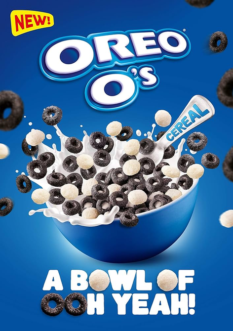
bright red & yellow - pops out. "new" makes it feel exclusive and urges you to get it.
bowl is spilling over, cereal pieces all over, this ads a lot of movement and excitement to the ad, makes it more eye-catching and interesting to look at.
again, cereal pieces become letters, this poster sticks to a very blue colour scheme, mainly 2 colours (blue and white)

Based on my analyses, both adverts will feature the mascot in some way. the landscape ad will most likely contain some sort of info in small text near the bottom, the main image will feature a mock up of the cereal box design with the logo and persuasive text.
the portrait ad will be relatively similar but with less information and a slightly different design.
i aim to keep the colour palate pretty minimal and stick to two or three bright colours. the text will be bold, capital, smooth and outlined. I also want to misalign letters to give it that jumbled up look.
mock ups
next gen breakfast


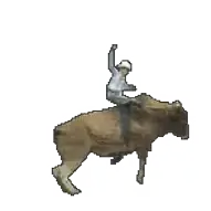
I like the idea I had for these adverts, which was incorporate the mascot in different poses in an effort to make him feel more personified. however, these sketches alone took me a long time and i'm not sure how I feel about doing it for the final ad considering the amount of time I have left.
ill try and stay somewhat true to my mock ups although the final product may look/feel different.

PRODUCTION

drawing my mascot with a mouse and 70% stabilizers on an unresponsive photoshop was a pain to say the least. I do not think ill draw another mascot for the portrait ad.

I started my production on photoshop, but after repeatedly trying and failing to save/open/convert the file due to its size, I decided to move to ibis paint.


the background colour for the ads is different but I wanted them to be the same. the portrait ad looks a bit more saturated/darker/orange.
for the landscape ad i tried the logo on the left and on the right, but i felt having it on the right made it look less empty.